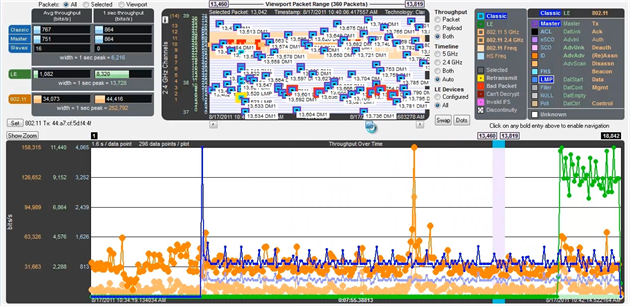
Coexistence View - Throughput Graph
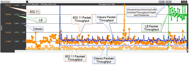
Coexistence View Throughput Graph
The Throughput Graph is a line graph that shows packet and/or payload throughput over time as specified by the radio buttons in the Throughput group. If the Both radio button is selected, packet and payload throughput are shown as two separate lines for each technology. The payload throughput line is always below the packet throughput line (unless both are 0).
The data lines and y-axis labels are color-coded: Blue = Classic Bluetooth, Green = Bluetooth low energy, Orange = 802.11. Each data point represents a duration which is initially 0.1 s. Each time the number of data points per line reaches 300, the number of data points per line is halved to 150 and the duration per data point is doubled. The duration per data point thus progresses from 0.1 s to 0.2 s to 0.4 s to 0.8 s and so on.
Throughput Graph Y-axis labels
The y-axis labels show the throughput in bits per second. From left-to-right the labels are for 802.11, Bluetooth low energy, and Classic Bluetooth. The duration of each data point must be taken into account for the y-axis label’s value to be meaningful. For example, if a data point has a duration of 0.1 s and a bit count of 100, it will have a throughput of 1,000 bits/s, and the y-axis labels will be consistent with this.
Throughput Graph y-axis labels.
Retransmitted packets and bad packets (packets with CRC or Header errors) are excluded from throughput calculations.
Placing the mouse pointer on a data point shows a tooltip for that data point. The tooltip first line shows the throughput, the throughput type (packet or payload), and the technology. Subsequent lines show the bit count, the duration of the data point, the packet range of that duration (only packets of the applicable technology from that packet range are used for the throughput calculation), and the number of the data point (which is 0 for the first data point in each line).
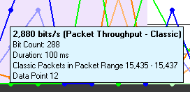
Data point tooltip
The Throughput graph tool tips can be shown in the upper-left corner of your computer screen to provide an unobstructed view. Refer to Relocating Tool Tips.
A discontinuity is when the timestamp going from one packet to the next either goes backward by any amount or forward by more than 4.01 s. This value is used because the largest possible connection interval in Bluetooth low energy is 4.0 s. A discontinuity is drawn as a vertical dashed line. A discontinuity for a timestamp going backward is called a negative discontinuity and is shown in red. A discontinuity for a timestamp going forward by more than 4.01 s is called a positive discontinuity and is shown in black. A positive discontinuity is a cosmetic nicety to avoid lots of empty space. A negative discontinuity is an error.
A negative discontinuity.

Three positive discontinuities.
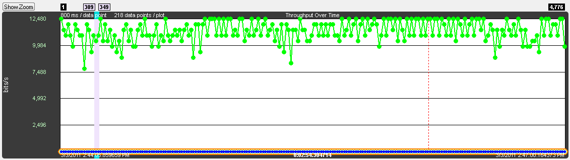
The viewport is the purple rectangle in the Throughput Graph. It indicates a specific starting time, ending time, and resulting duration, and is precisely the time range used by the Timeline. The packet range that occurs within this time range is shown above the sides of the viewport.
Throughput Graph Viewport
The viewport is moved by dragging it or by clicking on the desired location in the Throughput Graph (the viewport will be centered at the click point).
The viewport is sized by dragging one of its sides or by using one of the other zooming techniques. See the Zooming subsection in the Timeline section for a complete list.
The dots on the data points can be toggled on and off by clicking the Dots
button. Dots are different sizes for each technology so that they reveal overlapping data points which otherwise wouldn’t be visible. A tooltip can be displayed for each dot.
Dots can be removed for greater visibility of the plots when data points are crowded together.
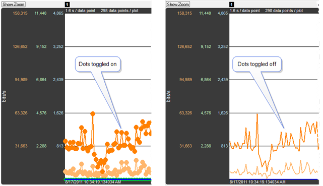
Dots Toggled On and Off
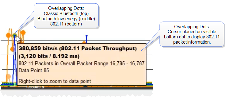
Overlapping Dots Information Display
Clicking the Show Zoom button
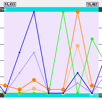
displays the Zoomed Throughput Graph above the Throughput Graph. The Zoomed Throughput Graph shows the details of the throughput in the time range covered by the viewport in the Throughput Graph. Both the Zoomed Throughput Graph and the Timelines are synchronized with the Throughput Graph’s viewport. The viewport is sized by dragging one of its sides or by using one of the other zooming techniques listed in the Zooming subsection in the Timelines section.
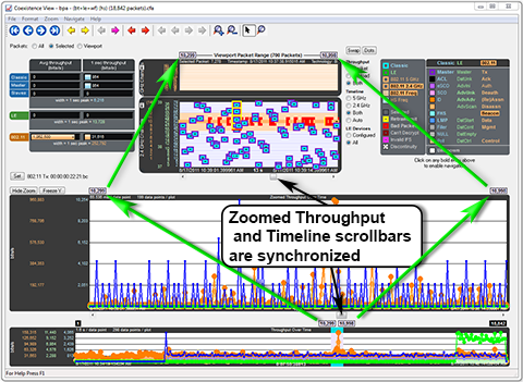
Synchronized Zoomed Throughput Graph and View Port
The largest value in each technology in the Zoomed Throughput Graph is snapped to the top of the graph. This makes the graph easier to read by using all of the available space, but because the y-axis scales can change it can make it difficult to compare different time ranges or durations. Clicking the Freeze Y
button freezes the y-axis scales and makes it possible to compare all time ranges and durations (the name of the button changes to Unfreeze Y and a Y Scales Frozen indicator appears to the right of the title. Clicking the Unfreeze Y
button unfreezes the y-axis scales.
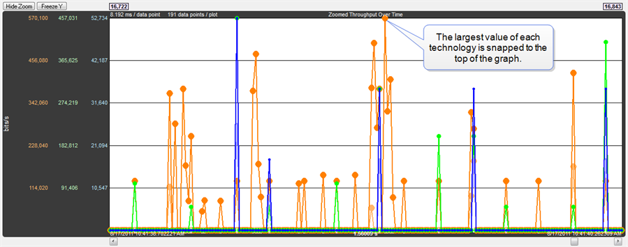
Zoomed Throughput Graph- Largest Value Snaps to Top
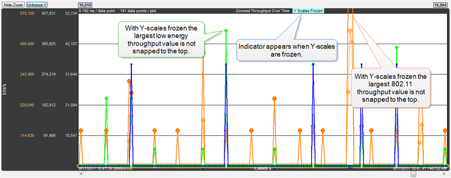
Zoomed Throughput Graph - Freeze Y keeps the y-axis constant
Interval Menu
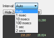
The Interval drop-down menu is used to set the duration of each data point in the Zoomed Throughput graph. The default setting is Auto that sets the data point interval automatically depending on the zoom level. The other menu selections provide the ability to select a fixed data point interval. Selecting from a larger to a smaller interval will display more data points. Should the number of data points exceed 30,000, no data is displayed and a warning will appear in the graph area.
Selecting the Zoom Cursor
button changes the cursor to the zoom cursor
. The zoom cursor is controlled by the mouse wheel and zooms the viewport and thus the Timelines and the Zoomed Throughput Graph. The zoom cursor appears everywhere except the Throughput Graph, which is not zoomable, in which case the scroll cursor is shown. When the zoom cursor is in the Timelines or Zoomed Throughput Graph zooming occurs around the point in time where the zoom cursor is positioned. When the zoom cursor is outside the Timelines and the Zoomed Throughput Graph the left edge of those displays is the zoom point.
The Throughput Graphs for Classic Bluetooth in the Coexistence View and the BluetoothTimeline can look quite different even though they are plotting the same data. The reason is that the Coexistence View uses timestamps while the BluetoothTimeline uses Bluetooth clocks, and they do not always match up exactly. This mismatch can result in the data for a particular packet being included in different intervals in the two Throughput Graphs, and can have a significant impact on the shapes of the two respective graphs. This can also result in the total duration of the two Throughput Graphs being different.
Another factor that can affect total duration is that the BluetoothTimeline's Throughput Graph stops at the last Classic Bluetooth packet while the Coexistence View’s Throughput Graph stops at the last packet regardless of technology.
 button swaps the positions of the